
Responsive Web Design What Is It And Why Do I Care
For many years the standard dimensions of website designs were increasing steadily along with the demand and sale of larger high-resolution monitors. Then came the rise of the smartphone, tablet, and netbook – leaving designers and developers scratching their heads as to how their grand visions for their sites were going to work on these small and low res screens.
To accommodate these devices, the dimensions of web designs have not increased in several years and we have seen clients adopt new technologies such as iphone apps and mobi sites.
These achieve client goals in offering a mobile friendly custom layout for portable devices – which work well. The disadvantage to this is the management of content and website layouts.
When you create a mobi version of a website you need to create different templates for every type of device out there that you want the site to work on. So if you consider iphone, android, ipad, blackberry, nokia (and the list goes on…) plus your normal desktop designs this can get pretty costly and timely! Also you then have multiple versions of your website that you have to manage content for.
Generally the fast wordpress website is considered as the one that provides the customers with the good amount of the response. The rate of the response of the site will be the factor in deciding the best site to attract the people fastly. The speed and the accuracy that the website provides is the crucial factors in deciding the right platform.
Enter Responsive Web Design
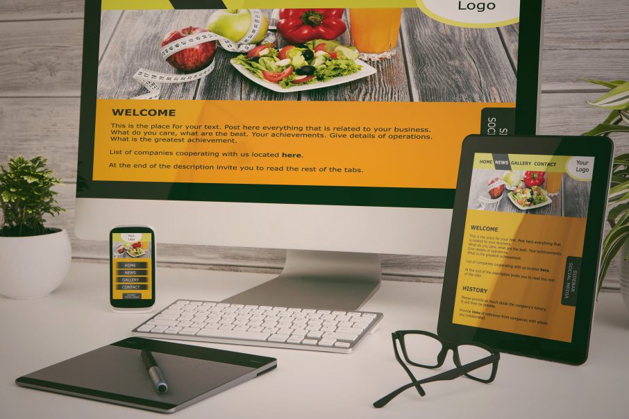
Responsive design is a new technique that enables you to maintain a single site that will adapt/work on all devices without designing multiple versions of your site.

What is responsive web design?
Responsive web design or RWS is the creation of a website that scales and adapts its layout automatically to ensure that it fits any device. The website is designed on a series of “grids” and you can determine the way the site recalibrates based on the screen size.
What?
In simple English – the site hides certain sections of itself or rearranges its layout vertically to suit different devices. But in doing this you can simplify its content so it is more suited to a mobile device.
E.g. Simplified navigation, vertical navigation, hiding large blocks of content – but still keeping your key calls to action and core site features available.